I need graphs to explain my each and every emotion and opinion about any given thing. It's just a natural evolution. Plus, it's really pretty. I like pretty things that explain things. Don't you?
The graph is from this guy and it's about the new Tough Alliance (TTA) release: New Chance.
I love singing pop songs with lyrics like this:
NO NO need for a baseball bat don't need no knife for a sharp attack no excuses no looking back we think too much about the things we lack
this neo violence pure self-defiance this neo violence the tough alliance
I've written plenty about TTA before. I'm not going to link it. We have a search button. You know how to use the internet, right? Right.
You've probably seen this all over. It's by Nagi Noda. I actually own a real Nagi Noda piece of art. It's not a dog-shaped hat made of hair, though. But it'll do for now.
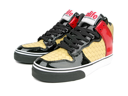
These are the new Alife sneakers, exclusive for Barneys.
These are the new Hellboy Adidas.
And these are the new Alife Asics, which I like better than the Barney ones.
The Kills are on the cover of 'Sup magazine. A couple of weeks ago, I discovered the magazine shop two blocks down from my office stocks the same magazines as Colette. This is going to save me a fortune in petrol. Lucky for you, 'Sup is also available online, for free.
The new Those Dancing Days video is like downloadable sunshine, so i guess I'll leave with that.
Don't mail me. You'll only get this message:
Hi,
I'm out of the office. Listening to the new N.E.R.D album fifteen times in a row.
Back whenever.
Best,
LGF


